The Power of Color: How to Choose Paint That Transforms Your Home
Paint is the fastest way to change a room's vibe, but it is not just about the shade. Here is how I use light and layout to make the right choice.
Understanding the color wheel is a designer's secret weapon. This video shows six perfect pairings, from bold contrasts like light blue and deep red to soothing analogous blends like blue and indigo, to help you create a professional look.
The direction a room faces dramatically affects how colors appear. This guide is the starting point for understanding how to work with natural light.
For North-facing rooms with cool, indirect light all day, I recommend warm, light-reflecting colors. Shades like Off-white, Light Beige, and Pale Yellow help to brighten the space and counteract the cool tones.
East-facing rooms get warm, amber light in the morning and cooler light in the afternoon. I use versatile neutrals like Pale-Beige, Vale Mist, or Interface Tan to balance the changing light throughout the day.
South-facing rooms are blessed with warm, bright light. To make the most of it without it feeling overwhelming, I suggest cool, soft colors like Pale Gray, Duck Egg, or a gentle Mauve.
West-facing rooms have muted light in the morning and intense warm light in the afternoon. Cool tones like Pale Gray, Wythe Blue, or Equestrian Gray are perfect for balancing the afternoon heat and creating a calm atmosphere.
Paint is a powerful tool for altering the perception of a room. This guide shows how to use color placement to make a room feel shorter, narrower, larger, or to highlight a specific feature wall.
Here are more visual tricks using paint. You can make a ceiling feel lower for a cozier vibe, or make a narrow room feel wider, all by strategically applying different colors to different walls.
This video demonstrates the psychology of paint and its effect on a room. I show how to use dark and light colors on different surfaces to visually enlarge, lower, or widen a space to fit your needs.
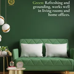
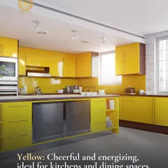
Color has a deep psychological impact. This guide explores the emotions and energy associated with different colors, like red for energy, blue for calmness, and yellow for happiness, helping you choose a palette that supports your lifestyle.
About The Power of Color
Most people choose a color based on a tiny swatch and regret it immediately. The secret is to observe how your room's natural light hits that wall at different times of the day. A paint shade that looks warm and inviting in a South-facing living room might look muddy or cold in a North-facing bedroom, so always test a large sample on the wall first before committing to the whole house.
Choosing paint color is rarely just about the hue. It is about understanding the conversation between light, volume, and mood.
The Directional Rule
I always tell my clients to check the window orientation first. If you have a North-facing room, you are dealing with cool, indirect light all day. Pure white can look gray and sterile here, so I suggest leaning into warm beiges or pale yellows. Conversely, South-facing rooms get warm, intense light. You can afford to go with cooler tones like gray or soft mauve to keep the room feeling balanced.
Visual Tricks with Paint
Paint is a powerful tool to fix architectural awkwardness.
- Want a room to feel wider? Paint the side walls in a lighter shade and the end wall in a slightly darker tone.
- Need to lower a high ceiling? A darker shade on the ceiling than the walls visually brings it down, making a large, empty space feel cozy and grounded.
- Narrow hallways? Keep the color consistent from floor to ceiling to blur the edges and remove the 'tunnel' effect.
Why Psychology Matters
Every color has a physical impact. Red stimulates, blue calms, and yellow energizes. In our 3D visualization process, I show my clients how these colors behave in their specific space before a single brush hits the wall. This saves you from the 'oops' moment of painting a bedroom vibrant orange and wondering why you cannot sleep.
Whether you are aiming for a luxurious vibe with off-whites like 'White Butter' or creating a focused home office with deep, grounding tones, the key is the layering. Do not just pick a color; pick a feeling.
Similar work from other experts
Browse through Curated picks from other experts on mytribe
 13
13


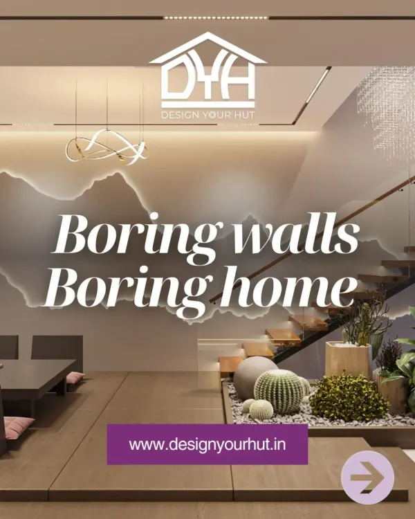
Turn Your Plain Walls Into A Design Statement
 9
9
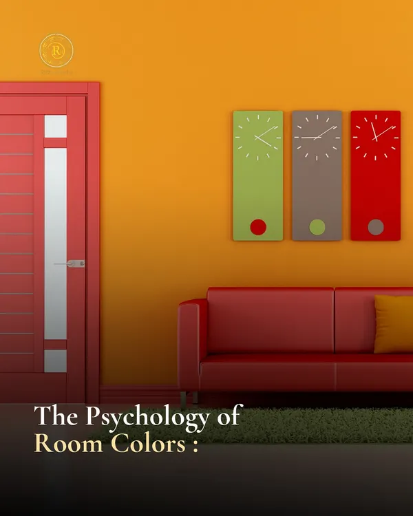
The Psychology of Color & Light: Designing Spaces That Feel Right
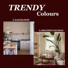
Design Inspiration & Trends for Modern Homes
 32
32
Interior Design Guides and Home Planning Tips
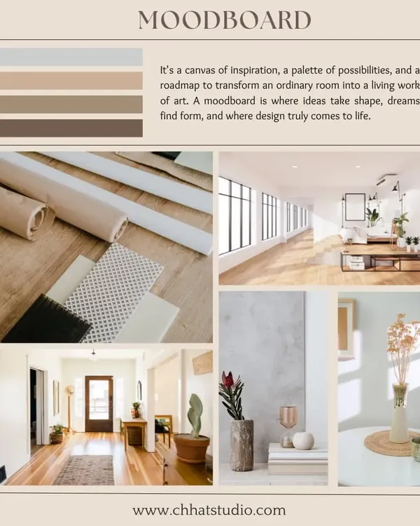
Practical Interior Design & Decorating Tips for Your Home
 11
11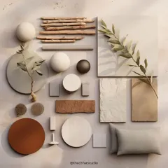
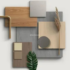
Design Elements and Material Inspiration
More from Full-Service Interior Design by Bespoke D.Designers by Divya Gupta
More services by Bespoke D.Designers by Divya Gupta