The Psychology of Color & Light: Designing Spaces That Feel Right
Your home’s color and light directly shape your daily mood. We blend scientific color psychology with expert lighting layers to ensure your space feels as good as it looks.
This image serves as an introduction to the psychology of room colors. The bold combination of orange and red demonstrates how different hues can create a dynamic and energetic atmosphere. Understanding these principles is the first step to designing a home that influences your mood positively.
Blue is a naturally calming and serene color, making it an ideal choice for bedrooms and study areas where focus and rest are important. This room pairs a deep blue wall with natural wood and woven textures to create a space that feels both tranquil and grounded.
Green connects us to nature and has a refreshing, grounding effect. It works beautifully in living rooms and home offices to promote balance and reduce stress. Here, a vibrant green sofa is the centerpiece of a modern and revitalizing living space.
Yellow is a cheerful and energizing color that can bring a sense of optimism and warmth to a space. It is an excellent choice for kitchens and dining areas, as seen in this bright and modern kitchen, to stimulate appetite and conversation.
Red is a bold and dramatic color that signifies energy and passion. To avoid overwhelming a space, I recommend using it as an accent color. In this room, the red wall makes a powerful statement without dominating the entire area.
White is a timeless and clean choice that can make any space feel open and bright. The key to using white effectively is to add textures, like the plants, wooden tripod lamp, and soft textiles seen here, to prevent the room from feeling too clinical and add warmth.
This video offers sophisticated alternatives to plain white walls. It showcases warm, nuanced off-white and beige paint colors like 'Fresh Fuel' and 'Blossom Tint'. These shades provide the same brightness as white but with added depth and warmth, creating a more inviting and luxurious feel.
Natural light is a key element in my designs. As this image shows, maximizing sunlight not only makes spaces feel larger and more inviting but also has proven benefits for mood and productivity. The lush greenery on the balcony further enhances the connection to nature.
In this video, I explain the secret behind why some homes feel so warm and welcoming. It comes down to a blend of lighting and color psychology. I discuss how warm-toned lights create a soothing ambiance, while earthy color palettes promote a sense of calm and balance.
About The Psychology of Color & Light
We don't just pick wall colors for their looks; we select them based on how they influence your daily rhythm and energy levels. For instance, replacing standard white with warmer, nuanced tones like 'Fresh Fuel' or 'Blossom Tint' instantly changes the room's temperature, making it feel grounded rather than clinical, especially when layered with precise 3000K warm lighting.
Color isn't just decorative; it's a tool for emotional regulation. A deep blue wall in a study isn't merely an aesthetic choice—it's a deliberate decision to create a zone for focus and deep work. Similarly, yellow in a dining area stimulates conversation and appetite. We apply these principles to your specific floor plan, ensuring colors aren't just pretty, but functional.
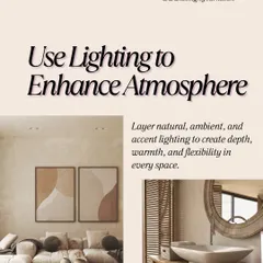
Lighting is the second half of this equation. Most homes suffer from flat, one-dimensional lighting. We fix this by introducing layered lighting schemes: ambient light for general visibility, task lighting for work areas, and accent lighting to highlight architecture or textures. We often pair this with Vastu principles, balancing the five elements through color placement and light positioning.
Whether you are working with a small apartment or a large property, the goal is consistency. We move away from generic white paint toward nuanced, layered tones that provide depth and warmth. When we design your lighting plan, we carefully choose color temperatures, mixing cool and warm sources to activate specific energy zones. This is the difference between a house that looks like a showroom and one that feels like a sanctuary.
Similar work from other experts
Browse through Curated picks from other experts on mytribe
Lighting & Color Design That Sets Your Vibe
 30
30
Mastering Color and Paint for Your Home
Mastering Color and Lighting Design
Spiritual and Mindful Home Design
Vastu Tips for a Harmonious Home
The Art of Spatial Psychology: Designing for How You Feel
Find your perfect design style.
Search for specific interior design services or project types.
More from Vastu-Compliant Interior Design by Ritzy Route
More services by Ritzy Route