Project Spotlight: Qoqobae Ice Cream Parlor
A charming French-inspired parlor in Jayanagar, designed with a distinct pink and grey palette to foster social connection.
A quick tour showing how the Qoqobae space comes to life. From the window branding to the cozy interior seating and customers enjoying their treats, this video captures the friendly and lively ambiance we created.
The main entrance to Qoqobae, featuring a custom arched glass door. This architectural element is central to the French cafe concept, creating an elegant and memorable entryway that contrasts with the dark grey facade.
A daytime view of the Qoqobae entrance. The pink accents and whimsical "Hey!" sign add a playful touch, inviting passersby into the charming ice cream parlor.
The outdoor seating area at Qoqobae, designed for customers to enjoy Bengaluru's pleasant weather. This space extends the cafe's footprint and enhances its street presence, making it a visible and active part of the neighborhood.
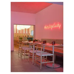
A minimalist seating nook inside Qoqobae. The textured pink wall, simple wooden bench, and the brand's logo create a clean, photo-worthy corner that is both functional and aesthetically pleasing.
A detail shot showing the mix of materials within Qoqobae. The patterned floor tiles, white metal chairs, and indoor plants work together to create a space that feels layered, comfortable, and full of character.
The main seating arrangement inside the parlor. I used a combination of built-in benches and movable tables to offer flexible seating options, accommodating both small groups and larger social gatherings.
The service counter and menu display at Qoqobae. The design integrates functionality with the overall aesthetic, using clean black counters to ground the space and framed art to add a personal, curated touch.
About Project Spotlight: Qoqobae Ice Cream Parlor
Designing a retail space like Qoqobae means balancing high-traffic utility with an inviting brand identity. We used a bold pink and dark grey palette to catch attention from the street, while selecting hard-wearing flooring and durable surfaces to keep maintenance simple, even with pet-friendly, high-turnover use.
Every project I take on starts with a conversation about what the brand needs to say. For Qoqobae, the goal was to create a space that felt like an escape, an adorable French-inspired cafe tucked into the busy streets of Jayanagar.
To achieve this, we moved away from standard commercial interiors and leaned into a more romantic aesthetic. The arched glass door at the entrance serves as a focal point, immediately setting the tone before a customer even walks in. Inside, we created a fluid layout that allows for different modes of seating, whether someone is dropping by for a quick sundae or settling in for a chat.
Practicality remains at the core of my design process. We used industrial-grade finishes for the high-traffic areas, ensuring the light pink walls and white metal furniture hold up to daily wear. The choice of flooring was intentional. It adds character to the space while hiding the scuffs of a busy parlor. By managing the spatial flow and integrating the brand’s playful identity into every corner, we turned a small footprint into a social hub that welcomes both people and their pets.
Similar work from other experts
Browse through Curated picks from other experts on mytribe
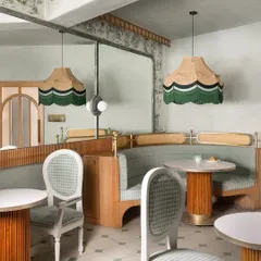
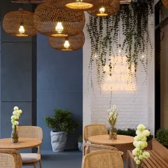
Parisian-Inspired Café Interiors in Bangalore
 13
13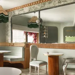
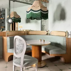
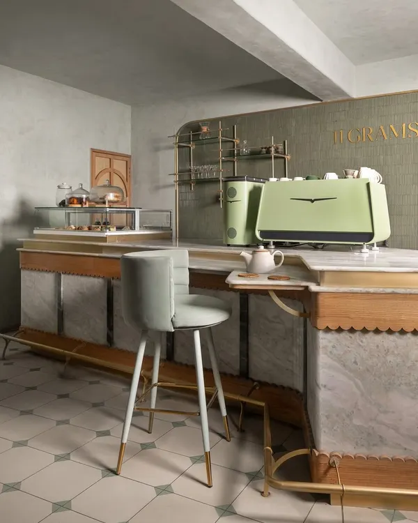
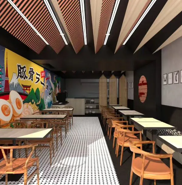
11 Grams Cafe: Interior Design & Cafe Styling
 6
6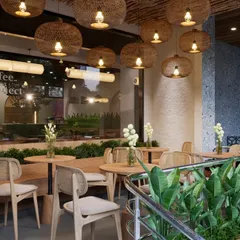
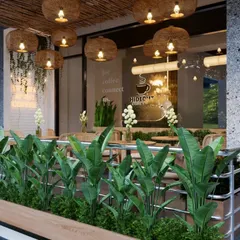
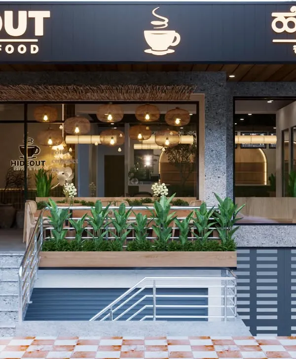
Hideout Cafe: A Modern Biophilic Design Project
 6
6
Restaurant & Cafe Interiors That Tell Your Brand Story
 6
6
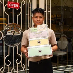
Project Spotlight: Lucky Chan Sushi Parlour
 5
5
Cafe and Restaurant Interiors
Looking for design inspiration?
Search for office, retail, or restaurant interior projects in Bengaluru.
More from Commercial Architecture & Interior Design by Inari Atelier
More services by Inari Atelier