Vibrant Color Contrast Blouse & Saree Designs
Bold pairings that break the mold. I love mixing unexpected shades to make your outfit stand out. Browse through some of my favorite color stories.
A stunning contrast of deep purple and vibrant green. I used a green brocade fabric for the sleeves of this blouse to perfectly match the border of the accompanying crepe silk saree.
This rich magenta silk saree with a gold border is beautifully complemented by a contrasting green blouse. I added delicate floral embroidery that picks up the pink from the saree.
I love this classic combination of dark green and red. The blouse features a beautiful embroidered border in red and gold, which makes it a perfect match for the checked red crepe silk saree.
A festive and bold combination of red and green. This blouse features heavy paisley embroidery on the sleeves, making it a perfect statement piece for this crepe saree.
This blouse in a deep purple features simple, elegant leaf-motif embroidery along the neckline. It's a beautiful and understated pairing for the contrasting green and purple crepe silk saree.
For this lavender silk saree with a multi-colored border, I designed a contrasting bottle green blouse. The embroidery on the sleeves picks up the pink and red tones from the saree's border.
A bright and cheerful combination. This deep pink blouse features a simple floral embroidered border that perfectly complements the vibrant orange butti-work saree.
This blouse design plays with the rich magenta and gold from the saree. The pleated puff sleeves add a touch of drama and traditional flair to the ensemble.
This sea green blouse is designed with delicate gold and red embroidery. It's a beautiful contrast to the maroon blouse piece it's shown with, illustrating how it can be paired with different sarees.
A striking combination of black, magenta, and gold. I designed this magenta blouse with heavy, traditional embroidery to be a bold and beautiful partner to a classic black and gold silk saree.
About Vibrant Color Contrasts
Getting the contrast right is more than just picking two bright colors. It is about matching the undertones of your saree border with the threadwork on the blouse. I focus on aligning embroidery colors so the blouse frame complements the silk, rather than fighting against it, which is how I achieve that clean, cohesive look.
When designing for vibrant contrasts, I start by looking at the saree border. If you have a classic Kanjivaram with a heavy gold zari border, adding a blouse with deep red or bottle green threadwork brings out the richness of the silk without making it look chaotic. For lighter Mysore silks or crepes, I prefer playing with modern color wheels—like lavender with bottle green or sea green with maroon.
My studio in Nelamangala is where we do the actual color testing. If you are visiting for a consultation, bring your saree so we can drape it with different blouse fabrics under natural light. This is crucial because fabric texture changes how a color reflects light. A matte crepe fabric will absorb color differently than the sheen of a silk blouse.
I also pay attention to the sleeve length and neckline. A bold contrast works best when the cut of the blouse doesn't interrupt the flow of the embroidery. Whether you are prepping for a Muhurtham or a casual event, the goal is to create a balance where the blouse honors the saree while still having its own personality. I handle everything from fabric sourcing to the final Aari work in-house, ensuring the finishing is as neat as the color choice.
Similar work from other experts
Browse through Curated picks from other experts on mytribe
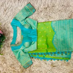
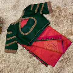
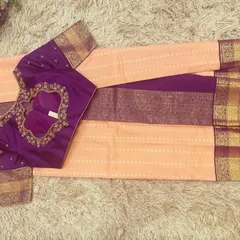
Colorful Saree & Blouse Pairings
Custom Saree Blouse Designs and Fabric Pairings
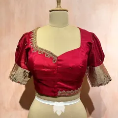
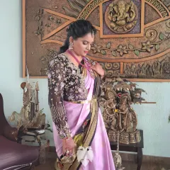
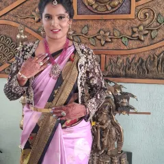
Our Design Portfolio: Custom Handcrafted Blouses
Custom Bridal Blouse Designs
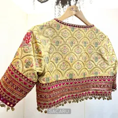
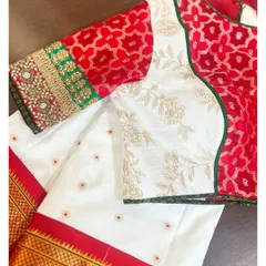
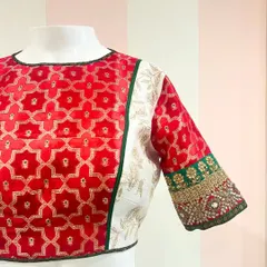
Statement & Patchwork Blouses: Custom Designs by Sacaru
 25
25

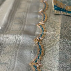
Handcrafted Bridal Blouse Designs
More from Curated Saree Sales & Exhibitions by Soul Couture
More services by Soul Couture