Nature-Inspired Brand Identity Design
I translate the patterns, forms, and balance found in the natural world into visual identities. My design process uses the principles of biomimicry to create brand marks that feel organic, grounded, and timeless.
A golden Tithoria tarricina chrysalis held against a plain background. Its form, a perfect example of natural fabrication, inspires my approach to creating structures and shapes in brand design.
The metallic sheen and organic shape of this chrysalis are a masterclass in natural aesthetics. Observing details like this helps me develop unique color palettes and textures for brand identities.
A close-up view of the chrysalis resting in my palm. The intricate patterns and golden pigment are a reminder that nature is the original designer, providing a blueprint for beauty and function.
Another perspective of the chrysalis, showing its delicate connection to a dried leaf. This relationship between elements in nature inspires the creation of balanced and cohesive visual identity systems.
The chrysalis hanging from a thin branch. This image captures a moment of transformation and potential, a core theme I strive to embed in the brands I help build.
A different angle showing the light catching the golden surface of the chrysalis. This interplay of light and form is a key principle I apply in visual design to create depth and interest.
The delicate chrysalis held in hand, showcasing its small scale yet significant structural complexity. This inspires me to create designs that are detailed and thoughtful, no matter the application.
The final primary logo for Gwel Tech LLP. The design combines a bold orange with a deep navy blue to create a memorable and professional brand mark that is instantly recognizable and reflects the company's focus on tech solutions.
A monochrome version of the Gwel Tech logo. This single-color variation ensures brand recognition and legibility in applications where the full-color palette is not suitable, such as on certain documents or merchandise.
The Gwel Tech logo shown in reverse on a solid background. Part of a complete brand identity system includes testing for legibility on both light and dark surfaces, ensuring the mark is always clear.
About Inspired by Nature
When I start a new logo, I rarely open software immediately. Instead, I observe organic forms—like the Fibonacci patterns in a shell or the structure of a chrysalis—to find a geometric logic that I can apply to your brand. This method ensures that the final design for a company like Gwel Tech isn't just a random shape, but a balanced mark that feels rooted in natural principles.
From Nature to Brand Identity
Design is not just about making things look good. It is about finding the inherent order in your business story and expressing it simply. My work focuses on translating the complexity of nature into visual systems that are easy to understand and hard to forget.
The Design Process
My process follows a deliberate, step-by-step path, much like how a structure grows from the ground up:
- Deep Research: I begin by understanding the roots of your business. We look at your brand etymology and core values, which I treat with the same respect as a foundation for a building.
- Hand-Sketching: Before using any digital tools, I use pencils and grids. This is where I test geometric proportions, ensuring the shapes have the same visual balance I see in natural objects.
- Digital Execution: Only after the sketch feels right do I move to high-fidelity vector illustration. Here, I define the color systems and typography that will define how your brand communicates across different platforms.
Case Studies in Geometry
Take the Gwel Tech LLP project. The goal was to create a mark that was instantly recognizable. By studying the form of a projector, I distilled it into a geometric G that feels solid yet dynamic. Similarly, for Telen Tech LLP, I focused on the 'technological pathway' in their brand identity, utilizing a strict yellow and grey palette to represent both the precision of IT and the warmth of a human-centric brand.
Whether it is a full brand system or a logo, I prioritize longevity over trends. My aim is to deliver a visual identity that feels as solid and natural as the environment that inspires it.
Similar work from other experts
Browse through Curated picks from other experts on mytribe
 7
7

Our Core Design Philosophy: Architecture That Breathes
My Featured Work: Hand-Drawn Design and Branding

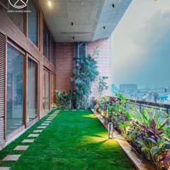
Strategic Landscape Architecture and Biophilic Design
 23
23


Branding and Iconography for Modern Apps
Brand Identity & Publication Design
 10
10
Climate-Responsive Architecture and Flood-Resilient Urban Design
More from Brand Identity Design by Travis Designs
More services by Travis Designs