Mastering Color and Paint for Your Home
Choosing the right paint is about more than just picking a shade; it is about lighting, direction, and creating a vibe. Here is how I use color science and Vastu to make your home feel balanced.
The direction a room faces determines the quality of natural light it gets all day. My guide to paint colors by direction helps you choose the right shades to make your space feel balanced and bright, no matter which way it's oriented.
For North-facing rooms that receive cool, indirect light, I recommend warm and light-reflecting colors. Shades like off-white, pale yellow, and rich brown can counteract the coolness and make the space feel cozier.
East-facing rooms get warm, amber light in the morning and cooler light in the afternoon. To balance this, I suggest versatile neutrals like pale-beige, vale mist, or even a soft Normandy grey to look beautiful all day long.
South-facing rooms are blessed with warm, bright light throughout the day. You can embrace cooler tones like pale gray, duck egg, or even a sophisticated mauve to create a calm and balanced atmosphere.
West-facing rooms have muted light in the morning and intense warm light in the afternoon. Cool tones like pale gray, wythe blue, or equestrian gray help balance the afternoon warmth and keep the room feeling comfortable.
As the legendary designer Paul Smith explains, color is a physical, three-dimensional element. This is why I create mood boards with real material and fabric samples, not just digital swatches, to see how colors truly interact in your space.
Many people think brown is an outdated color, but I believe it's making a huge comeback. Here I am in a space that shows how modern neutrals and natural textures can make brown feel incredibly chic and current.
One way to bring brown back in style is with rich textures. This bathroom uses a warm brown limeplaster on the walls, creating a seamless and earthy feel that is both luxurious and calming.
A brown corduroy sofa is a perfect example of using texture to make the color feel modern. The ribbed fabric adds depth and a tactile quality, making the furniture a cozy and stylish centerpiece.
Patterns can also revive a classic color. This kitchen floor features a timeless checkered pattern in brown and cream, adding a touch of rustic charm that is both warm and visually interesting.
About Mastering Color & Paint
I do not just pick swatches off a fan deck. Before recommending a single shade, I analyze the light orientation of your room, whether it is North-facing with cool, indirect light or West-facing with harsh afternoon warmth. I then create a physical mood board with material samples to see how that color interacts with your furniture and textures in real-time. This saves you the frustration of painting a room only to find the color looks completely different once the sun goes down.
The Science of Color Selection
Color psychology is real, but it is nothing without context. Every room in your home has a specific 'light profile' based on its direction.
- North-facing rooms: Often receive cool, indirect light. I usually suggest warmer tones like pale yellow or beige to stop the space from feeling clinical.
- South-facing rooms: These get intense, bright light. You can afford to use cooler grays, mauves, or blue-toned shades here without making the room look dark.
- East and West: These spaces change dramatically throughout the day. I recommend neutrals that can handle the shift from morning amber light to afternoon shadows.
My Color Consultation Process
When we work together, we move past generic choices. I focus on:
- Material Interaction: Paint does not exist in a vacuum. I look at your flooring, your joinery, and your upholstery. A brown sofa looks different against a beige wall than it does against a crisp white one.
- Vastu Alignment: A home should feel peaceful. I integrate Vastu principles to ensure the colors in your rooms—especially the bedroom and living area—promote positive energy and restfulness.
- 3D Visualization: Before you commit to a paint code, we view the colors in a 3D render. This helps us see how lighting, cove details, and furniture layout will affect the final look.
Bringing Trends Home
Trends are great for inspiration, but they have to fit your life. Whether it is the Pantone Color of the Year or a textured limeplaster finish, I help you decide what is a passing fad and what will actually make your home feel comfortable and stylish for years to come. Let’s create a space that feels like you, not just a magazine cutout.
Similar work from other experts
Browse through Curated picks from other experts on mytribe
 9
9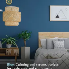
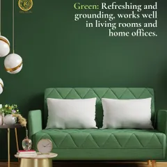
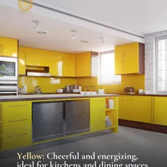
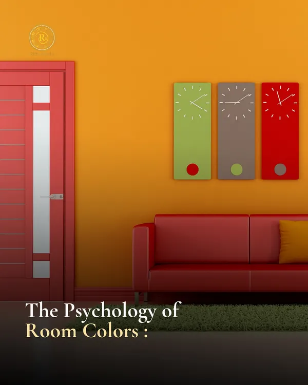
The Psychology of Color & Light: Designing Spaces That Feel Right
Vastu for a Harmonious Home: Practical Energy Alignment
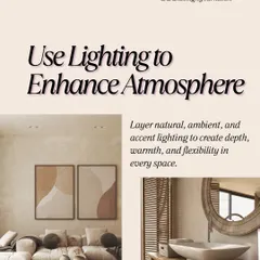
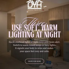
Lighting & Color Design That Sets Your Vibe
Harmonizing Your Home with Astro-Vastu Guidance
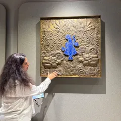
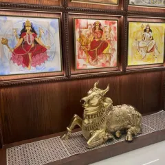
Spiritual and Mindful Home Design
Practical Interior Design & Decorating Tips for Your Home
More from Interior Design Planning & Visualization by Bespoke D.Designers by Divya Gupta
More services by Bespoke D.Designers by Divya Gupta