Mastering Color and Lighting Design
A perfect space relies on the balance between your color palette and lighting plan. We break down the technical details—from specific paint codes to lighting temperatures—to help you achieve a professional, functional atmosphere at home.
Here are three of my favorite color combinations for your home. This reel showcases palettes like earthy green with natural wood and marble, which create a sophisticated and timeless look.
Behind the scenes at a villa project, where we are installing a stunning cascading chandelier. Lighting is a small detail that makes a huge difference, transforming a corner into a dramatic focal point.
Here's a foolproof color if you love the tones of white: Cotton Wool (L104) by Asian Paints. It's a soft, warm white that isn't too stark, making it perfect for creating a cozy and inviting atmosphere.
I get a lot of DMs about where to source limewash paint. Some great vendors in India include Colortex, Colourtale, and Sazuka. They offer a range of colors to help you achieve that beautiful, organic, chalky finish on your walls.
This is my favorite taupe color: Silk Route (N013) by Asian Paints. It's a perfect neutral that sits between grey and beige, adding warmth and sophistication to any room.
Don't believe everything you see. This building in Italy looks like it's made of expensive stone blocks, but it's actually a clever texture paint job. With a great painter, you can create depth and shadow to achieve expensive-looking finishes for less.
This is one of my most-used and almost-viral color codes from Asian Paints: Raw Cotton (8459). It's a soft, neutral beige with warm undertones that creates a tranquil and inviting ambiance, perfect for living rooms and bedrooms.
This is a quick guide to choosing the right lighting temperature for different areas of your home. I recommend warmer light (2700K-3000K) for relaxing areas like bedrooms and dining rooms, and slightly cooler light (3500K-4000K) for kitchens and home offices.
The secret to perfect-looking walls is a good base. Applying wall putty fills in all the imperfections and creates a smooth surface, which ensures better paint adhesion and a flawless, durable finish.
I am a huge fan of neutral color palettes. There's something so elegant, soothing, and timeless about them. This bedroom, with its layers of beige, wood, and soft textures, is a perfect example of a calming, neutral space.
About Mastering Color & Light
Most people select a paint color based on a small swatch, but lighting conditions at different times of the day significantly alter how that color appears on your wall. We always recommend testing a sample directly on your surface, alongside your planned lighting, to ensure the undertones of shades like Pilgrim or Raw Cotton work with the natural light your specific room receives.
Building a Foundation for Color
A beautiful paint job is only as good as the surface underneath. We stress the importance of proper base preparation, starting with high-quality wall putty. This fills imperfections and ensures your paint adheres evenly, providing the durability needed for the longevity of your finish. Without this step, even the most expensive color will fail to show its true character.
Our Go-To Color Palette
When working with neutrals, we focus on depth and warmth rather than flat, stark tones. For a soft, tranquil vibe in living rooms and bedrooms, we frequently use Asian Paints' 'Raw Cotton' (8459). If you are looking for something that bridges the gap between beige and grey, 'Silk Route' (N013) adds sophistication. For walls featuring moulding or detailed joinery, 'Pilgrim' (6129) offers a chic, mid-tone grey that brings structure to a room without feeling cold.
The Science of Light
Lighting is not just about visibility; it defines the mood of your home. We use a layered approach to light planning:
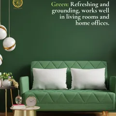
- Relaxing Zones: For bedrooms and dining areas, we recommend warmer temperatures between 2700K and 3000K. This creates an intimate, cozy atmosphere.
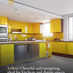
- Functional Zones: For kitchens and home offices, we shift to cooler temperatures, typically between 3500K and 4000K. This clarity reduces eye strain and helps you focus on the task at hand.
Applying the 60-30-10 Rule
To keep a room balanced, we follow the 60-30-10 rule. Use your primary color for 60% of the room, typically the walls and floors. A secondary color occupies 30% of the space, often in furniture or curtains. The final 10% is reserved for accent pieces, allowing you to introduce bolder colors or textures without overwhelming the design. We are here to help you apply these principles to your specific floor plan.
Similar work from other experts
Browse through Curated picks from other experts on mytribe
Home Interior Design Tips & Style Inspiration

The Power of Color: How to Choose Paint That Transforms Your Home
 9
9
The Psychology of Color & Light: Designing Spaces That Feel Right
Expert Interior Design Tips to Refine Your Space


Expert Interior Design and Lighting Tips for Your Home

Lighting & Color Design That Sets Your Vibe
Looking for specific design help?
We can assist with material selection, room layouts, or renovation planning.
More from Home Renovation & Remodeling by AAA Interiors
More services by AAA Interiors