Kitchen Color Trends & Vastu Inspired Design Ideas
From Vastu-compliant hues to trending 2025 palettes, find the perfect colors that make your kitchen feel spacious, functional, and uniquely yours.
According to Vastu, orange is a vibrant and inviting color that balances fire and earth elements, creating an energizing atmosphere in the kitchen.
Green is associated with growth and peace. Using it for cabinets or a backsplash can bring a fresh, calming, and balanced energy to your kitchen.
Yellow is the color of happiness and is known for fostering warmth, creativity, and positivity. It's a great choice for walls or decorative accents.
Red stimulates the fire element and is the color of energy and passion. Use it for an accent wall or backsplash to add warmth and strength to your kitchen.
The colors you choose can influence mood and functionality. This gallery is designed to help you find the perfect palette for your kitchen makeover.
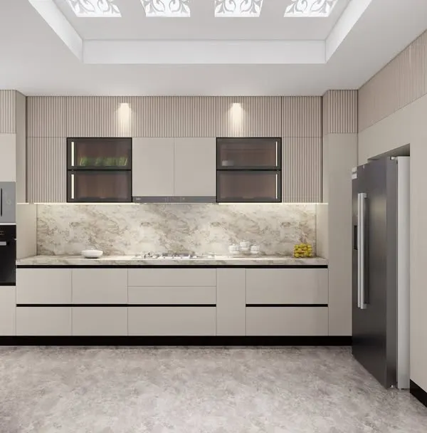
A warm, neutral color palette creates a calm and sophisticated atmosphere. This combination of beige, brown, and wood tones is timeless and inviting.
This earthy, rustic palette combines a deep terracotta wall color with off-white cabinets, creating a warm and cozy farmhouse-style kitchen.
A moody and sophisticated palette combining sage green cabinets with a deep navy blue backsplash and a white marble countertop.
For a bold and cheerful kitchen, this palette combines vibrant yellow cabinets with a striking black and white patterned backsplash.
Exploring Pantone's Color of the Year 2025, Mocha Mousse. This warm, earthy brown brings a sense of comfort and elegance to any kitchen.
About Inspiration Hub: Colors & Trends
In a Mumbai kitchen, color is not just about aesthetics, it is a tool to manage space. A dark shade might look sophisticated in a magazine, but in a compact area with limited natural light, it can make the room feel cramped. I often recommend high-gloss acrylics for smaller kitchens because they reflect light and create an illusion of depth, whereas matte finishes in earthy tones like terracotta work better in open, airy layouts. Let's pick a palette that balances your personal style with the reality of your daily cooking routine.
Picking the right color scheme is about how you want to feel when you walk into the kitchen for your morning chai. Many clients ask me about the 2025 'Mocha Mousse' trend, which is a fantastic warm brown. It adds a sophisticated, grounded touch to shaker-style cabinets and pairs beautifully with white marble. However, for a busy household, the choice often depends on maintenance.
Vastu and Color Psychology
If you follow Vastu, we can integrate color carefully to balance elements. Red is powerful and energizing, but if a full red kitchen feels too loud, I suggest using it for a backsplash or as an accent strip against neutral cabinetry. Green, on the other hand, is excellent for bringing a sense of calm and freshness, especially if you have a smaller kitchen that needs to feel less cluttered.
Matching Finish to Light
It is not just the hue, but the finish that changes everything. If your kitchen gets very little natural sunlight, stay away from dark matte finishes. Instead, opt for light, reflective surfaces like white or soft grey acrylic. This bounces light around the room, making a tiny space feel significantly larger. If you love dark, moody kitchens, ensure we design ample task lighting under your overhead cabinets to avoid working in shadows.
Making Trends Last
Trends like the earthy palettes or pastels look great today, but I design for longevity. We use high-quality, moisture-resistant laminates and PU coatings that hold their color even after years of cleaning and humidity. When we sit down to design, tell me what colors make you happy, and I will show you how to layer them into a layout that stays practical and clean for years.
Similar work from other experts
Browse through Curated picks from other experts on mytribe
 16
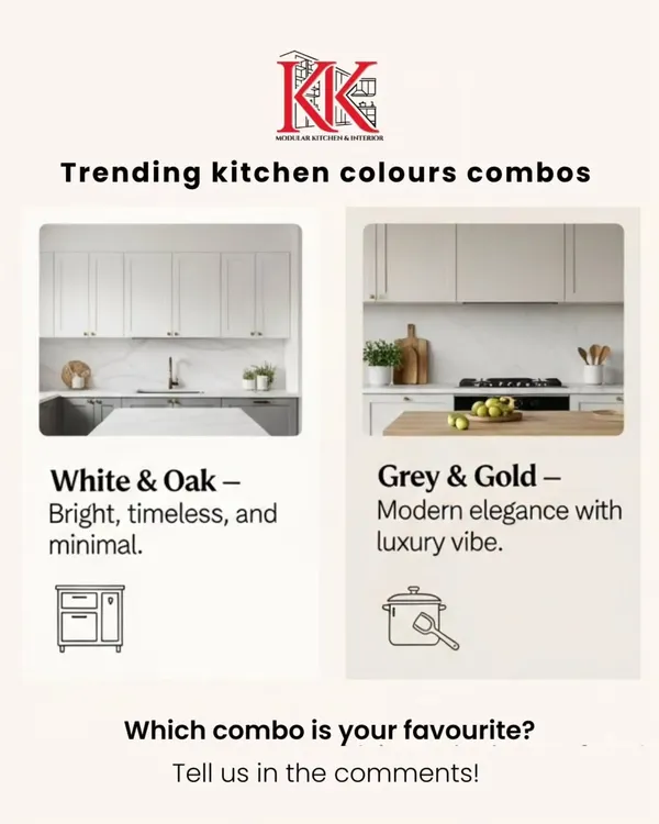
16Modular Kitchen Design Ideas and Expert Kitchen Tips
Modern Kitchen Design Trends and Expert Tips
 28
28
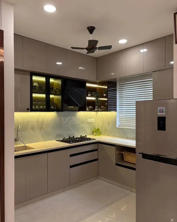
Dual-Tone Kitchen Designs for a Vibrant Home
 17
17
Vibrant & Modern Kitchen Designs
 18
18
Explore Modular Kitchen Design Concepts
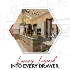
Modern Kitchen Design & Smart Storage Inspiration
More from Custom Modular Kitchens by Kitchen Studio
More services by Kitchen Studio