The Designer's Toolkit: Branding Essentials and Visual Strategy
Good design is more than aesthetics. It is the visual language that speaks to your customer before you even say a word. Here is a look at the foundational elements we use to build brand identities.
Color is the foundation of a brand's visual mood. This image showcases a soft and feminine color palette inspiration, featuring shades of pink, perfect for beauty, wellness, or lifestyle brands.
A warm and energetic color palette inspiration. These shades of orange are great for food and beverage brands, evoking feelings of fun, enthusiasm, and appetite.
This is a neutral and sophisticated color palette. The combination of soft blue, beige, and tan creates a calm, trustworthy, and professional feel suitable for corporate or high end service brands.
A fresh and natural color palette inspiration. The mix of peach, light yellow, and green tones is perfect for brands focused on health, wellness, or organic products, creating an earthy and vibrant look.
Font choice can make or break a design. Here we pair the classic, elegant Bodoni FLF with a flowing Signature script font. This combination is perfect for luxury, fashion, or beauty brands seeking a sophisticated feel.
This font pairing combines the clean and readable Tenor Sans with the delicate Lato Hairline. It's a modern and minimalist combination that works well for tech, design, or lifestyle brands with a clean aesthetic.
Here is an example of a classic and strong font pairing. The London font, which is a Didone style, paired with Intro Rust Line creates a look that feels both timeless and slightly rustic, great for heritage brands.
This pairing features Black Mango, an elegant serif font, with the more modern and clean Darker Grotesque. This contrast creates a balanced and stylish look suitable for premium consumer goods or editorial content.
About The Designer's Toolkit
We do not pick colors or fonts because they look nice. We pick them because they trigger a specific psychological reaction. When we suggest a Serif font over a Sans-Serif, we are thinking about your brand authority, readability, and where the customer is browsing, be it a mobile screen or a physical product label. It is the small, technical stuff that adds up to a big conversion.
Design is the engine room of any brand. Whether you are launching a startup or giving your business a digital facelift, your visual identity determines how people perceive you in the crowded Mumbai market.
The Psychology of Color
Color is never just a preference. It is data-backed communication. For food and beverage clients, we lean into warm, energetic palettes that trigger appetite and fun. For corporate or high-end service brands, we pivot toward neutral, sophisticated combinations that signal trust and stability. We do not just guess; we audit your competitor landscape and choose colors that force your audience to stop scrolling.
Typography That Communicates
Font choice can make or break your brand message. A clean, minimalist pairing works for tech or design-forward brands, while classic serif fonts convey heritage and luxury. We look at the interplay between legibility and personality. Our goal is to ensure your brand guidelines stay consistent across every touchpoint, from your Instagram highlights to your packaging.
Our Process
We start every engagement with a deep dive into your business goals. We do not just hand over a logo. We provide a full brand bible covering usage, spacing, and tone. If our initial design ideas feel unconventional, trust the process. We push boundaries to ensure your brand stands out, not just blends in.
Similar work from other experts
Browse through Curated picks from other experts on mytribe
Brand Identity & Publication Design
 6
6


Custom Logo and Brand Identity Systems for Your Business
Featured Branding and Design Work
 23
23


Branding and Iconography for Modern Apps

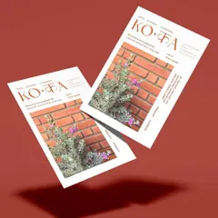
Our Featured Design Work and Brand Stories
 12
12


Brand Campaigns & Lookbooks
More from Branding & Visual Identity by Entrée Studio
More services by Entrée Studio