Lighting Design Guide: How to Choose the Right Light
Lighting isn't just about brightness. We break down the technical basics like beam angles, color temperature, and layout planning to help you illuminate your space effectively.
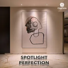
This short, informative video demonstrates how different beam angles, from a narrow 24 degrees to a wider 60 degrees, can dramatically change how an object is lit. Understanding this is key to effective accent and art lighting.
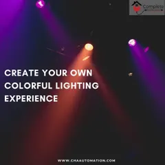
Lighting is all about creating a mood. This artistic shot, with its vibrant purple and blue hues, shows how colored and dynamic lighting can be used to completely transform the feel of a space and evoke emotion.
A duplicate of the previous image, this reinforces the concept of mood lighting. The use of color and shadow can turn a simple room into an immersive and atmospheric experience.
About Lighting Education
Light isn't just about brightness. A narrow 24-degree beam creates dramatic highlights on art, while a 60-degree beam washes a space for general ambiance. Getting the angle wrong is the quickest way to ruin a well-designed room. Understanding these basics is the difference between a flat-looking home and a space that feels intentional.
Beyond the Bulb
Many homeowners treat lighting as an afterthought, picking bulbs based on wattage alone. After 25 years in this industry, we’ve learned that the secret to a great home environment isn't more light, but the right kind of light.
Understanding Beam Angles
As you can see in our guide, beam angles dictate where the light goes.
- Narrow Beams (24°): Perfect for accent lighting. Use these to highlight a painting, a textured wall, or a specific decor piece.
- Wide Beams (60°+): Best for general or ambient lighting. Use these to fill a corridor or living room without creating harsh shadows.
The Importance of Color Temperature
- 3000K (Warm White): Creates a cozy, intimate atmosphere. Ideal for bedrooms and living areas.
- 4000K (Natural/Cool White): Provides a crisp, clean look. Best suited for kitchens, study areas, or workspaces where visibility is critical.
Why CRI Matters
If you have high-end interiors, you need a high Color Rendering Index (CRI). Our architectural lighting, specifically our COB downlights, maintains a CRI >90. This ensures that the colors of your furniture, wood finishes, and art look exactly as they should under daylight conditions. Without this, your expensive decor might look dull or discolored.
Designing Your Space
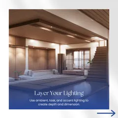
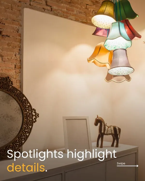
Lighting is layering. We recommend starting with ambient light to set the foundation, adding task lighting for functionality, and finishing with accent lighting to create depth. If you're struggling to balance these, we offer free design consultations at our Chickpet showroom. We can walk you through the technicals and help you plan a layout that actually works for your lifestyle.
Similar work from other experts
Browse through Curated picks from other experts on mytribe
Expert Lighting Advice: 40 Years of Experience
 20
20


Interior Design Tips & Expert Planning Advice
 12
12
The Art of Illumination: Lighting Design for Your Home
 5
5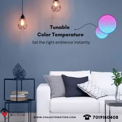
Intelligent and Dynamic Lighting Solutions for Your Home
 6
6Lighting and Ceiling Designs That Actually Work
 4
4

Intelligent Lighting Automation for Modern Homes
More from Lighting Design Consultation by Adithya Lamps
More services by Adithya Lamps