Interior Paint Colors and Material Combinations
Finding the right palette is more than just picking a paint chip. Here are my favorite combinations, material pairings, and specific paint codes to help you create a space that feels personal.
Here are three of my favorite color combinations for a sophisticated home interior. Pairing shades like olive green with natural wood and marble creates a look that is both timeless and on-trend.
This is a repeat of media 11, showing three great color combinations.
Here are three color and material combinations that are here to stay. I love pairing natural textures like rattan and limewash with earthy tones to create spaces that feel warm, organic, and timeless.
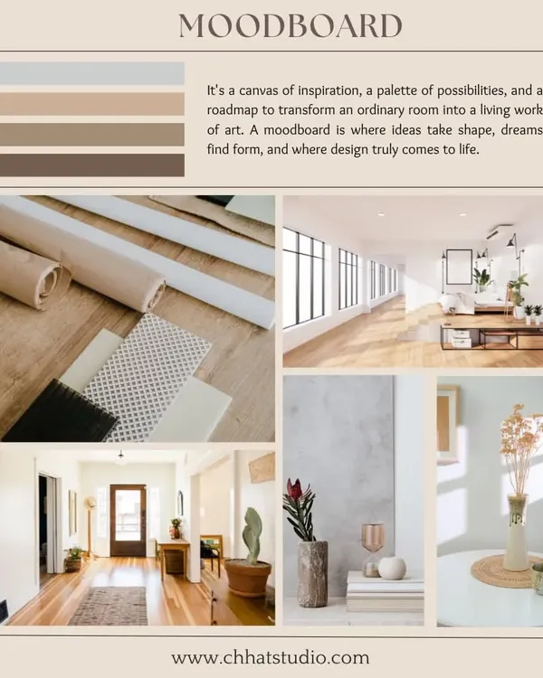
Choosing the right paint or polish color is a make-or-break decision in a project. It's about harmonizing colors across all materials, from walls and upholstery to flooring, to create a cohesive and balanced look.
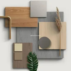
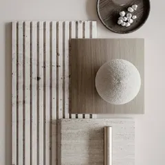
Timber and textured plaster is a timeless material combination. The warmth and natural grain of the wood pairs beautifully with the organic, tactile quality of the plaster, creating a rich and earthy feel.
This chart shows some of my favorite material pairings. Combining terrazzo with brick, or travertine with dark wood, creates a beautiful contrast in texture and tone that adds depth to any interior.
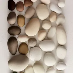
The combination of terracotta and beige terrazzo creates a wonderfully warm and sophisticated aesthetic. The earthy tones of the terracotta add rustic charm, while the terrazzo brings a timeless, classic feel.
Sage green and oak wood is a material combination that creates a calming, natural look. The soft green on the walls paired with the warm oak furniture results in a space that feels both rustic and elegant.
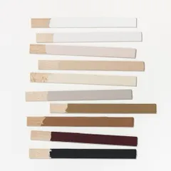
"Raw Cotton" (8459) from Asian Paints is one of my most-used neutral colors. It's a soft, warm beige that creates a tranquil and inviting ambiance, and it's versatile enough to complement almost any decor style.
Here are the neutral paint codes for a recent project. The walls are "Raw Cotton" (8459) and the study table is "Twinkling Star" (8466), both by Asian Paints, creating a soft and cohesive look.
About Material & Color Lab
Picking a wall color based on a tiny swatch is usually a mistake because lighting changes everything. I always suggest testing your favorites—like 'Raw Cotton' or 'Silk Route'—on large boards around the room at different times of the day to see how the color behaves in your natural light before you commit to painting a full wall.
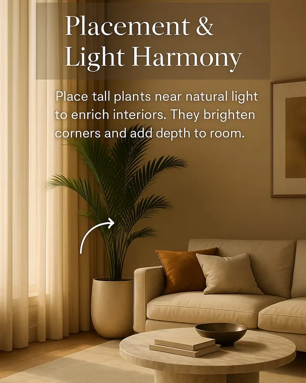
Beyond just picking a shade, design is about how materials talk to each other. When I work on a space, I look at the intersection of texture and tone. For example, pairing a rough, organic element like rattan or limewash with clean, modern lines creates a balance that makes a room feel lived-in, not like a showroom.
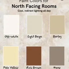
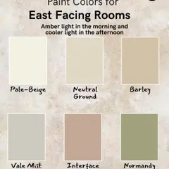
Color is never static. A shade of white might look sterile in a morning-facing room but cozy in a south-facing study. That is why I rely on specific codes from Asian Paints, like 'Cotton Wool' (L104) for those who want a warm, inviting white without yellow undertones, or 'Pilgrim' (6129) for a grey that does not lean too blue.
If you are struggling with a palette, try these three steps:
- Pick your anchor material: This is the non-negotiable element, like your flooring or a large piece of furniture.
- Define your mood: Are you going for warm and rustic or minimal and clean?
- Test, don't guess: Paint large samples on boards and move them around your space to see the true effect.
I also focus heavily on material pairings. Terrazzo mixed with warm brick or travertine paired with dark wood brings depth that a single color simply cannot achieve. It is not about filling a room; it is about creating layers.
Need help deciding? Whether you are trying to match existing furniture or starting from a blank slate, I can help you finalize the right combination for your home. Reach out to discuss what works for your specific lighting and space.
Similar work from other experts
Browse through Curated picks from other experts on mytribe
 11
11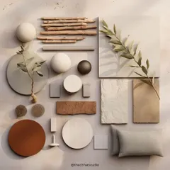
Design Elements and Material Inspiration
 5
5
Material & Mood Boards for Home Interiors
Find Your Perfect Palette: Home Wall Colour Inspiration
The Power of Color: How to Choose Paint That Transforms Your Home
Design & Material Insights
 11
11
Expert Interior Design Insights and Style Tips
Looking for specific design help?
Browse my other services to see how I can help with your home project.
More from Furniture Design & Interior Styling by AAA Interiors
More services by AAA Interiors